Wednesday January 8th… Dear Diary. The main purpose of this ongoing blog will be to track United States extreme or record temperatures related to climate change. Any reports I see of ETs will be listed below the main topic of the day. I’ll refer to extreme or record temperatures as ETs (not extraterrestrials).😉
Main Topic: Twentieth Anniversary of Counting Surface Records/Early January Record Scoreboard Update And Climatological Review
Dear Diary. This month marks the 20th anniversary in which I came up with the idea of counting the number of daily surface records, both hot and cold, to see if there were any climatological trends. After one decade of doing this my research culminated in Dr. Gerry Meehl’s et al record study, published in 2009, which predicted that ratios of hot to cold records would be rising substantially during the 21st century in conjunction with overall global warming:
https://agupubs.onlinelibrary.wiley.com/doi/full/10.1029/2009GL040736
Here is a 2015 update:
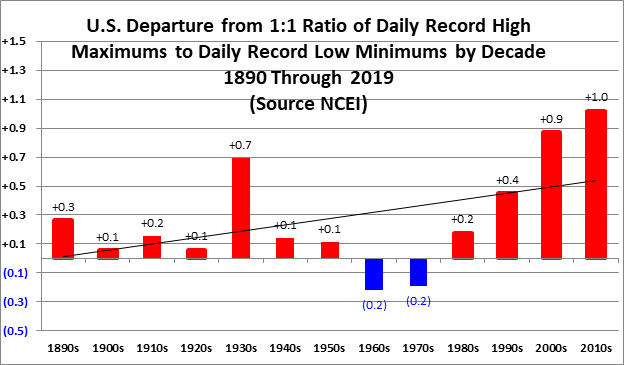
Now after two decades of numerous data updates we see that there are some stark, disturbing trends as noted by the following graphs, which mark the completion of my research through the 2010s:

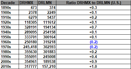
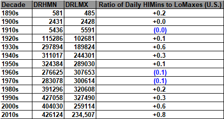
Here are record counts (including ties) that go into the above two charts from
https://www.ncdc.noaa.gov/cdo-web/datatools/records:
This proxy data indicates that for the United States the 2010s were warmer than the 2000s, and it has already been proven that the 2000s were the warmest decade in human history.
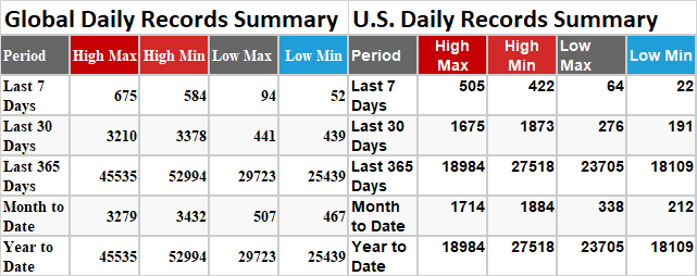
I do wish that NCEI would archive global totals on their record count site. Here is a snapshot I took of record count totals taken at the end of 2019 from their main graphic. I’ll try to produce the same snapshot again at the end of 2020:
Keep in mind that as individual surface sites become eligible after 30 years of record keeping these counts will slowly go up with time as record reports get added. Also, since NCEI will make a few corrections these counts will vary slightly with time. Over the last twenty years I’m finding that overall ratios for each decade do not change substantially.
Here on this site we present monthly summaries near the 8th or 9th of each month, and each is available if you want to go back through my Extreme Temperature Diary archive.
December 2019 got ranked by the National Center for Environmental Information as a well above average December, temperature wise, for the lower 48 states coming in as 6th warmest or 120th coldest since records began being kept in 1895:
https://www.ncdc.noaa.gov/cag/national/rankings/110/tavg/201912
Here we see rankings for each state in the contiguous United States:
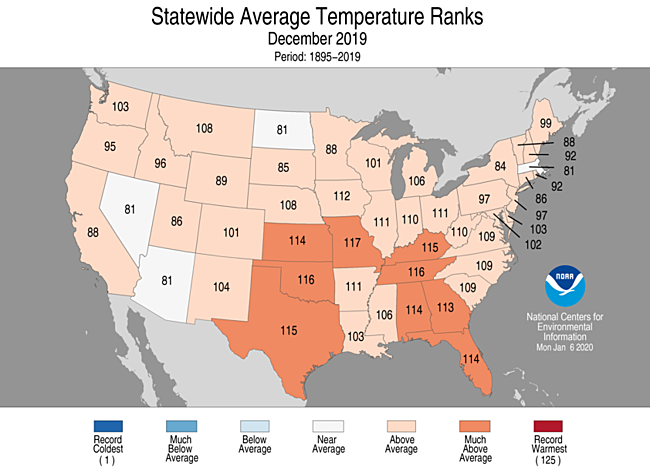
This chart is very disturbing because usually we at least see one portion of the lower 48 state with relatively cool conditions. The one for December 2019 is warm from coast to coast.
Across the Great Lakes we are seeing this mostly due to that December warmth:
Here are my two U.S. Daily Record Scoreboards updated through 1/5/2020 (data compiled from the following NCEI site):
https://www.ncdc.noaa.gov/cdo-web/datatools/records

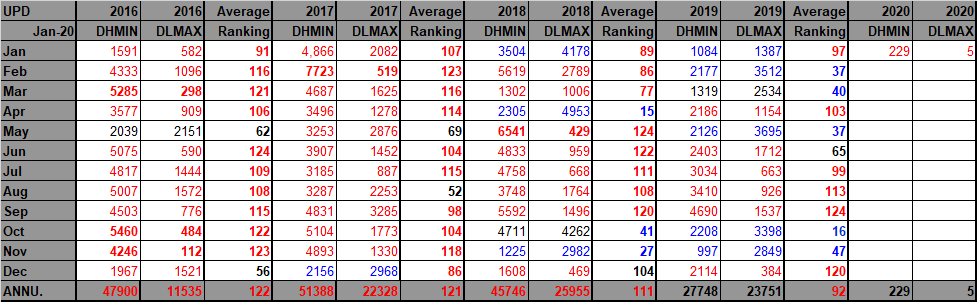
DHMX= Daily High Max Reports. DLMN= Daily Low Min Reports. DHMN= Daily High Min Reports. DLMX=Daily Low Max Reports.
For these data sets all monthly ratios of > 10 to 1 DHMX to DLMN or > 10 to 1 DLMN to DHMX are in bold type. The rankings are for the lower 48 states with the warmest ranking since 1895 of average temperatures being 126 and 1 being the coldest as of 2020. Blue colors represent cold months and red warm. Those months and years with counts close to a 1 to 1 ratio of highs to lows are colored black. Boldly colored months, such as May 2018, have ratios of more than 10 to 1 daily record highs to lows or lows to highs, and are either historically hot or cold, most of which have made news.
December 2019 saw a near 8-1 ratio of record DHMX to DLMN individual record counts, so the color I used for this month was red on the top chart.
December 2019 had a near 6-1 ratio of record DHMN to DLMX individual record counts, so the color I used for this month was red on the bottom chart.
Due to climate change we will see less blue colors on these Record Scoreboards with time, and in the United States December 2019 was no exception.
Also, looking at the record scoreboards, I wonder how long a cooling trend will last going into the 2020s, which we have seen since 2016?
As stated, the ranking for December 2019 was 120, which was colored red. I color rankings +10 or -10 from the average ranking of 63 black indicating that these are near average temperature wise.
January 2020 has gotten off to an above average temperature start looking at current record tallies.
The following yearly chart is complete for the 2010s:

The top climate and environmental story for December 2019 was that Australia had its hottest December on record culminating in horrific fires that continue into January 2020. I fear that we will see more climate crisis related horror moving through 2020.
Here is more climatology coming in today:
My thanks go to Bob Henson for including my research in this post:
Here is more climate and weather news from Wednesday:
(As usual, this will be a fluid post in which more information gets added during the day as it crosses my radar, crediting all who have put it on-line. Items will be archived on this site for posterity. In most instances click on the pictures of each tweet to see each article.)
Here are some ET’s coming from Hong Kong and Japan:
(If you like these posts and my work please contribute via the PayPal widget, which has recently been added to this site. Thanks in advance for any support.)
Guy Walton- “The Climate Guy”