Monday July 22nd … Dear Diary. The main purpose of this ongoing blog will be to track United States extreme or record temperatures related to climate change. Any reports I see of ETs will be listed below the main topic of the day. I’ll refer to extreme or record temperatures as ETs (not extraterrestrials).😉
New Australian Record Count Findings
It’s been a few weeks since I competed my initial research on Australian record count trends. During that time I have wanted to present these findings via a post to the public there has been heat wave after heat wave taking my attention and the lead spot on my daily posts. We have a tiny window today before I see many notes on this week’s European heat wave to present some of this material for the lead spot…..so here is a brief presentation:
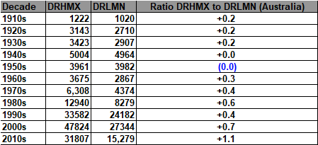
Australian record counts from the U.S. National Center For Environmental Information database go well back prior to 1910, but tail off significantly prior to 1970. Here are my raw numbers (DRHMX=daily high maximum records, DRLMN= daily low minimum records, DRHMN=daily record high minimum records, DRLMX=daily record low maximums):

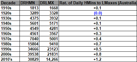
Please keep in mind that one count could be a tied record or one set by several degrees. Also, this is the kitchen sink of records in the NCEI database. These counts have different periods of records, or from different stations that have been keeping records for longer or shorter times. Still, we can see some stark climate change trends from Australia, which are very similar to those from the United States and other countries.
Let’s take a first look at two decadal bar graphs, one from the U.S. and one from Australia:
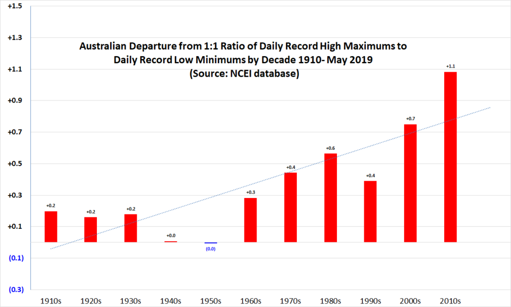
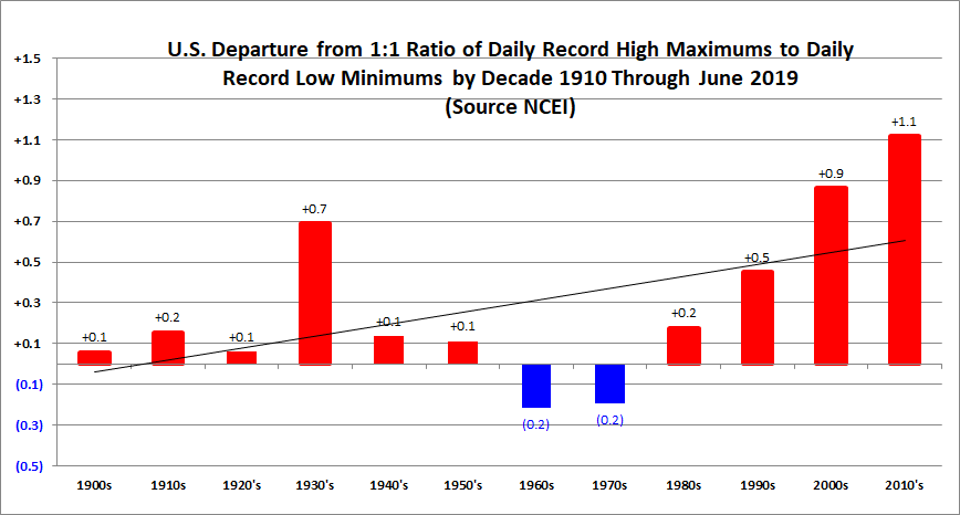
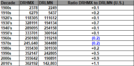
What’s striking is that both the U.S. and Australia have the same ratios for the 2010s, 2.1 to 1 of record daily high maximums to low minimums. Obviously, the ratios for this decade are higher than any others on the charts. One big difference is that the “dust bowl” spike for the U.S. does not appear in the Australian data. Mid 20th century cooling shows up on both charts.
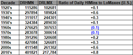
I thought it would be interesting to see how much the “nights warming faster than days” signature shows up for both the United States and Australia. I’ve already reported that this shows up as more record high minimums than high maximums within the U.S. dataset. Here is this result again:

And now Australia:
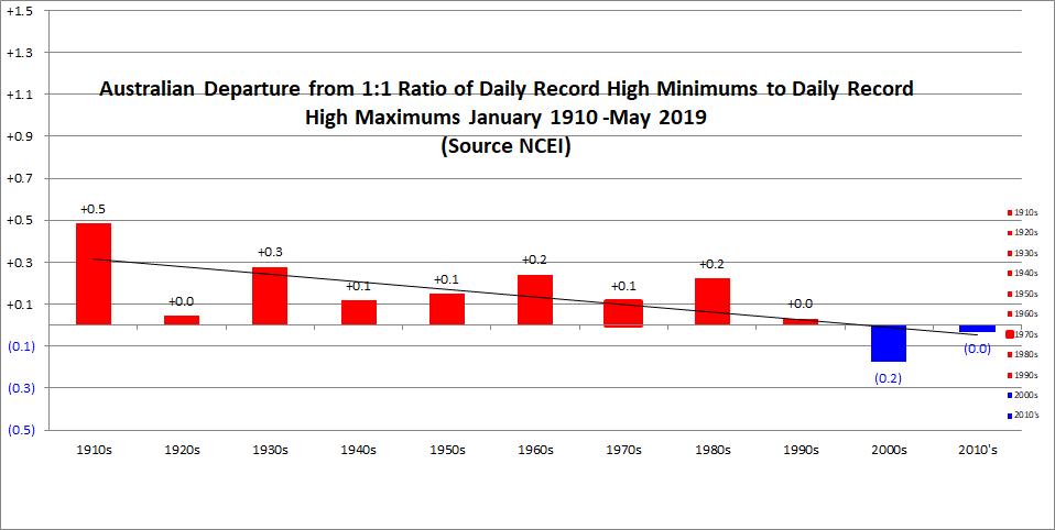
Well, the above chart was not what I was expecting…a decrease in the ratio of DRHMN to DRHMX in Australia instead of an increase. Just as a point of conjecture, perhaps this is due to the fact that a vast majority of stations in Australia are located on the coast and/or Australia is fairly arid compared with the United States. Maybe this trend is due since Australia is getting drier and the U.S. wetter? O.k. other climate scientists, I hope that you can give me a good answer for the behavior of these trends.
Here are the raw numbers for both datasets:

You can peruse all of this Australian record count data including many more charts of each decade here:
https://guyonclimate.com/2019/07/02/ncei-australian-daily-record-count-archive/
Here is more climate and weather news from Monday including more notes about the coming European heatwave:
(As usual, this will be a fluid post in which more information gets added during the day as it crosses my radar, crediting all who have put it on-line. Items will be archived on this site for posterity. In most instances click on the pictures of each tweet to see each article.)
Here is one big “ET” from Sunday:
(If you like these posts and my work please contribute via the PayPal widget, which has recently been added to this site. Thanks in advance for any support.)
Guy Walton- “The Climate Guy”