Lately those wanting to show warming trends have been using simple pictures or pictograms. A pictogram acts like a graph, but in most instances gets a point across faster and more precisely than say a bar chart. The human brain processes colors and pictures more easily than representative symbols.
The National Center for Environmental Information has started to use pictograms in their climate summaries. The following one for the lower forty-eight states caught my eye when it was released for the 2016 climate summary:
https://www.ncdc.noaa.gov/sotc/national/201613

This pictogram shows well how annual extremes in minimum temperatures have been rising, particularly since 1990. Most of the time cooler than average conditions are represented by blue colors and hotter red. Most alarmingly, 2016 had the highest values since 1910 from coast to coast, and that can readily be seen with just a glance at the maps. My friend Deke Arndt from the National Oceanographic and Atmospheric Administration, who is in charge of disseminating climate reports at NCEI, can be quoted, “As far as temperatures go, and especially “extreme” temperatures go, minimum temperatures (a.k.a. “Tmin”, “morning lows”, “overnight lows”, etc.) are increasing more than maximum temperatures (a.k.a. “afternoon highs”). This last year was the 2nd warmest for the US overall, but the warmest for minimum temperatures. I like this composite map, which shows which parts of the US have had extremely warm Tmins since 1910. The last two or three decades have really seen an expansive growth of warm Tmin extremes (in red – extremely cool Tmins are in blue). If you have plants or livestock, you know what warm summer nights mean. If you don’t have A/C, it’s rough. If you *do* have A/C, it’s expensive.”
As far as the globe goes, here is another stark pictogram from Ed Hawkins as retweeted by my friend Brian Kahn last fall:

Again, the hotter than average or red colors for each year can be plainly seen after 1990.
When looking at my own work I thought it might be better to add color showing months with significantly more than a one to one ratio of daily record highs to daily record lows in red and those with a significantly less in blue as shown in my first post. I call this “The Records Genome”, and I will be presenting more of this data in future posts. You can see trends in association with the raw data much better compared with this black and white version:

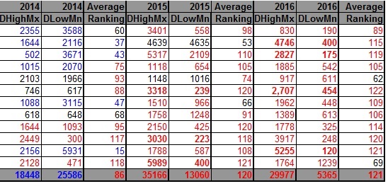
The bold font represents months with more than a ten to one ratio.
Yes, charts with color can be processed better by the human brain than black and white versions.
On my next post we will be taking a look at carbon pollution trends.
The Climate Guy